
A Terrible Chart
Do you see it?

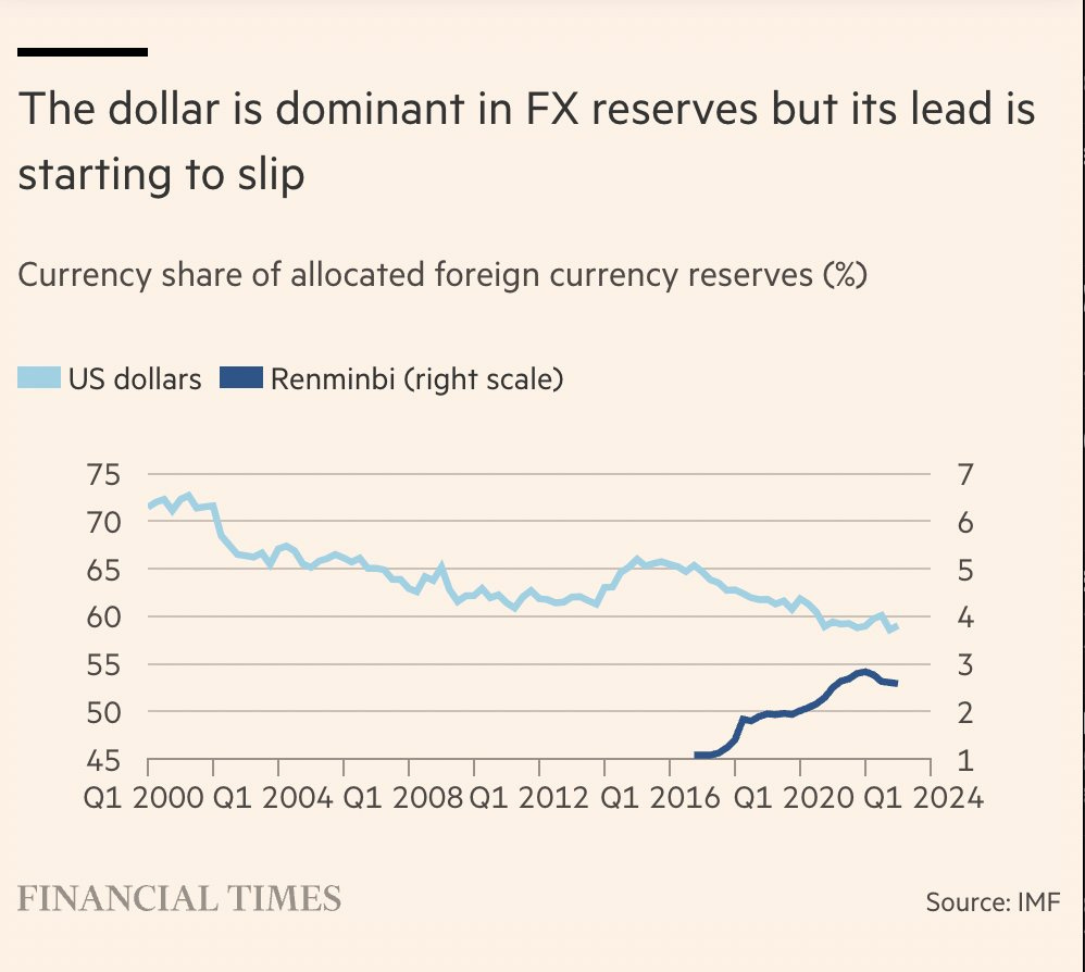
Earlier this week I wrote about how The Financial Times broke the story of the Wirecard Scandal. Kudos to them for that. Now The Financial Times is back on Econ Soapbox, but this week it’s to rap them on the knuckles. Several weeks ago they posted the above chart. It’s one of the most misleading graphics I’ve ever seen, and The Financial Times should know better.
The title of the chart tells the reader what the takeaway should be: the dollar is losing its dominance in the international currency market. A quick glance at the chart and a reader would think, “Wow! The Renminbi (China’s currency) is really gaining on the US Dollar in terms of foreign currency reserves. At this rate it might catch the US Dollar by the end of the decade!” Given the title of the graph and article, that appears to be what the Financial Times wants you to think. Unfortunately, it’s totally wrong.
What’s the problem? Look carefully at the graph. It’s a type of infographic known as a “dual axis chart”. It’s called dual axis because while the horizontal axis is normal, in that it has one scale (years), the vertical axis has two scales… kind of. On the left is the percentage of currency reserves that are US Dollar denominated. This scale ranges from 45 to 75 percent. The right side of the axis shows what percentage of currency reserves are Chinese Renminbi dominated. So both the left and right sides of the graph use percentage of currency reserves as the variable. The problem is that the scales are completely different. The scale of US Dollars as a percent of foreign currency reserves ranges from 45 to 75 percent, and the scale for Chinese Renminbi ranges from 1 to 7 percent.
The result is that it appears that the Renminbi is rapidly gaining on the US Dollar as a currency that countries like to have in their foreign reserves. The reality is far different. While the Renminbi has increased significantly in the last decade on a relative scale, on an absolute scale the Chinese currency is still rare. Even at its high point, fewer than three percent of global foreign currency reserves are in Renminbi. The different scales make it seem much larger. Plotting the two currencies on the same scale paints a far different picture:

Now that the two currencies are on the same scale, the truth comes out. Yes the US Dollar is slowly decreasing it’s market share, but the difference is not being made up by an increase in the Renminbi. By using the same scale for two different currencies, it is clear that the Renminbi is a minnow in foreign currency reserves. That isn’t to say the relative increase of the Renminbi isn’t noteworthy or important on its own, just that it is nowhere close to catching up to the US Dollar.
In general, using a dual axis graph should only be done when two different variables are overlaid to illustrate a relationship. For example, this graph from The Economist does it well:
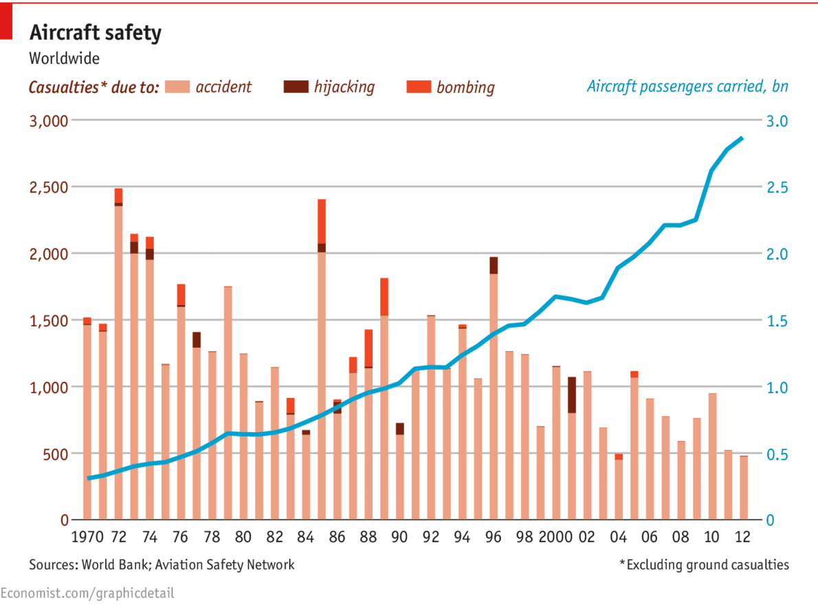
Just like the first graph, the horizontal axis is given in years. And again there are two different scales on the vertical axis. In this case, however, they are different variables. The left vertical axis gives the number of airline casualties per year. Happily, there appears to be a moderate downward trend. The right vertical axis shows the number of aircraft passengers per year in billions of people. Passenger traffic is increasing steadily over time. Both these graphs are useful on their own. the left shows that there are fewer airline casualties, the right that air traffic is increasing. Putting them together makes an even stronger impression; it is clear that fewer people are dying on aircraft even though the popularity of air travel has increased dramatically.
The key difference between the currency chart from the Financial Times and the air traffic chart from The Economist is that the former uses two different scales for the same variable (currency share), while the latter has two different variables plotted on top of each other (air casualties and air passengers). Having two variables overlaid is useful; having two scales of the same variable is suspicious. Even The Economist gets caught committing the same-variable-different-scale sin here:
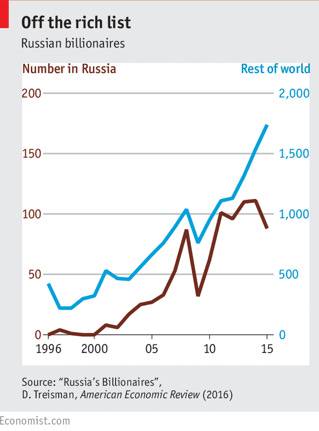
Again, at first glance it looks like Russia has around the same number of billionaires as the rest of the world. In reality Russia only has a fraction. Around 2011 on the chart the red and blue lines are almost on top of each other. Considering that both lines represent the number of billionaires a region has, one would expect them to be similar. But since the two lines are on different scales the gap is quite large. Reading the different scales, there were around 100 Russian billionaires while the rest of the world had around 1,100. So an order of magnitude difference!
One final point about the original Financial Times graph. Not only is the dual axis nature confusing, but the labeling on the horizontal axis is an absolute mess. It took me a few minutes to figure out for sure what label corresponded to what hash mark. “Q1 2000” corresponds to the first hash on the far left, “Q1 2004” corresponds to the third hash, etc. Why is the “Q1” even included? Just use the year. The reader will assume that each hash represents the first day/month/quarter of its respective year.
Apparently, some readers noticed this as well and told The Financial Times, as they have since updated the graph to the following:

Much better.