


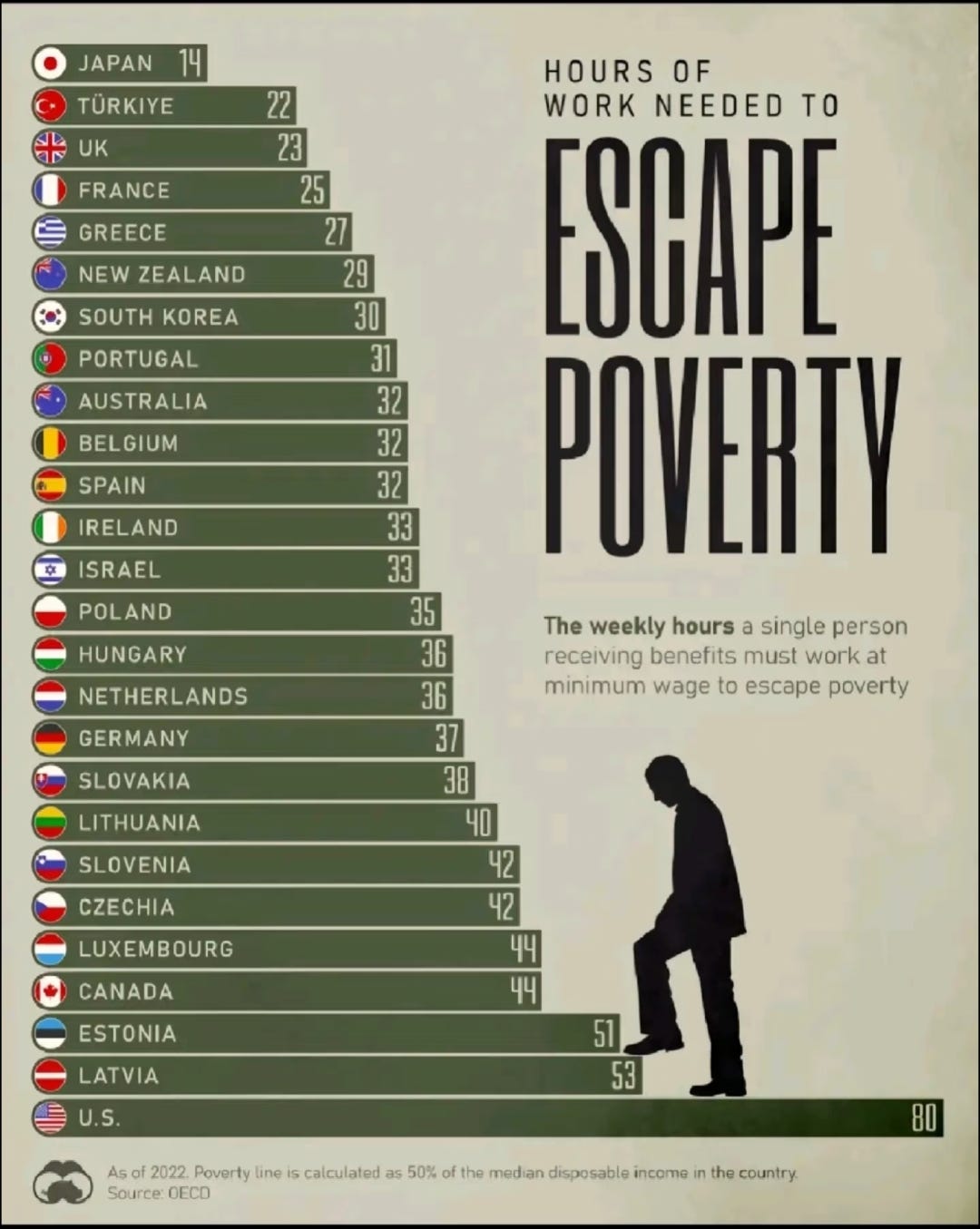
This infographic has made recent appearances on Twitter and Reddit. In a crowded field, it may be the worst I’ve ever seen. The infographic purports to show “the weekly hours a single person receiving benefits must work at minimum wage to escape poverty”, but is so far from achieving that goal that it’s hard to know where to start a critique. At the risk of my own sanity, let’s have a go at how this chart is unhelpful, misleading, and wrong.
1: The information isn’t useful for some countries
The minimum wage in the United States is deceptive because the majority of Americans don’t live in a place where the federal minimum wage is in force. For most Americans, a higher state minimum wage supersedes the federal minimum. In some cases, the the state minimum is over double the federal minimum. Does this chart assume that “minimum wage” is the federal minimum wage or some sort of state-weighted minimum wage? My guess is the former, but even the source, the OECD, doesn’t provide additional information. As the US federal minimum wage has remained set at $7.25 an hour since 2009, but the American economy has grown, it has become more and more irrelevant. Firms have found in most places that they have to pay more than the federal minimum to attract capable employees. Today, only 1.3 percent of American hourly workers earn the federal minimum wage or less. The national minimum wage just isn’t a binding constraint anymore. America is likely an outlier in this regard, as most other countries don’t have the wide spectrum of wealth that different regions of America have. This makes the usefulness of comparing the United States to other nations doubtful.
2: The data is wrong
When you come across something on the internet, it’s often useful to perform the “smell test”. That is, without looking up anything, does the information presented seem plausible? In this case, the answer is a resounding no. Regardless of other issues, there’s no way that someone in Japan can escape poverty by working only 14 hours a week. The Japanese are known around the world for their high work ethic and strenuous corporate culture. The idea that working fewer than two days a week gets a Japanese worker out of poverty fails the smell test entirely. No way.
Going to the source of the chart on the OECD website reveals how incorrect this data must be. Usually, the OECD is a reliable source, but something funky is going on here. The website allows users to see how long workers in the OECD (a group of high-income nations) would have to work to escape poverty given different wages and family dynamics. Users can choose between, say, a couple with two children or a single adult with no children and watch the hours change across different nations. Something odd happens with the United States, however. Regardless of the family dynamic, the data says that an American has to work 80 hours a week. I have no idea how this data was compiled, but it is impossible that a single adult with two children has to work the same number of hours as a single adult with no children to escape poverty. That every option produces 80 hours for the United States, while all the other countries change depending on the setting means the data is wrong. According to the same data, a couple in Japan with two children would only have to work two hours a week at the minimum wage to escape poverty. Two! The data is incorrect, plain and simple.
3: The chart doesn’t even show what is says it dead
The astute reader may have noticed the small print at the bottom of the chart, “As of 2022, Poverty line is calculated as 50% of the median disposable income in the country.”
Wait, what?
We have a measure of poverty in the United States. Granted, the official poverty rate is a worthless statistic, but other calculations have shown that poverty has fallen significantly over the last 50 years. Regardless, even if the data was useful and accurate (which it isn’t), the chart doesn’t actually show how much someone has to work to escape poverty. It shows how much a minimum wage worker would have to earn to make half the median disposable income (disposable income means income less taxes or other mandatory spending). The number of hours it takes a minimum wage worker to reach half the median income has little to do with poverty. It implies that as a nation gets wealthier, the poverty line goes up in lock-step with incomes. That’s nonsense. The poverty line and median disposable income have nothing to do with the other.
This infographic would make a Pravda editor blush. Nothing about the chart or underlying data has anything to do with poverty. Even with accurate data and methods, the only thing a chart like this would show is how long a minimum wage worker would have to work to earn the typical income. In a nation like the United States, that will be very high number. Not because America is bad, but because it’s rich.
Tremendously rich. The United States has the highest disposable income per capita in the OECD. Countries we usually think of as wealthy, such as Germany or Australia, would have to increase their disposable income by more than a fifth to equal the United States. Because typical incomes are so high, yes, workers at minimum wage jobs have to work more to reach the norm than in poor countries. This has its downsides, notably significantly higher inequality in the United States than in other OECD countries, but on net is a good thing.