
Another Terrible Chart (Bernie Sanders Edition)
Who posted this?

This is the worst chart I’ve ever seen on Twitter (I still don’t want to call it X). It should be framed and put in front of every data analytics classroom in America as a warning of the power numbers have in the hands of innumerate people. I'm at a loss to understand how this was posted by a two-time presidential candidate and sitting senator with nearly 15 million followers. Let’s dive in.
First, yes, I know that Bernie Sanders did not create this chart. I suspect he didn’t write the commentary above the chart or even know it was being posted. I do not understand why politicians have outsourced their personal social media handles. It seems that social media, at its best, allows the common man to interact with politicians who are usually behind closed doors and velvet ropes. I’m not claiming that Sanders posted this or even knew of its existence. Someone on his team certainly did, however, and that’s concerning. Someone who doesn’t recognize the inanity of this chart should not be advising a sitting senator.
Whoever posted this chart deserves to have sand stuck in their shoes every day for the rest of their lives. Fine sand that doesn’t actually hurt but sand you can feel working it’s way from the shoe into the sock where it then lodges in-between your toes and makes you have to determine whether it can be ignored or it’s worthwhile to take off your shoe and sock entirely, knowing that even after you brush off your foot some of that sand will somehow still be there, and then having your sock feel weird because somehow in the 30 seconds it was off your foot the sock now feels cold and sweaty and that cold, sweaty sock is now back on your foot, and there’s still sand in there that’s working it’s way in-between your toes. This is your life now.
Ok, maybe that’s overdoing it. I hope whoever made that chart stubs their toe today. Twice. That seems a more proportionate punishment.
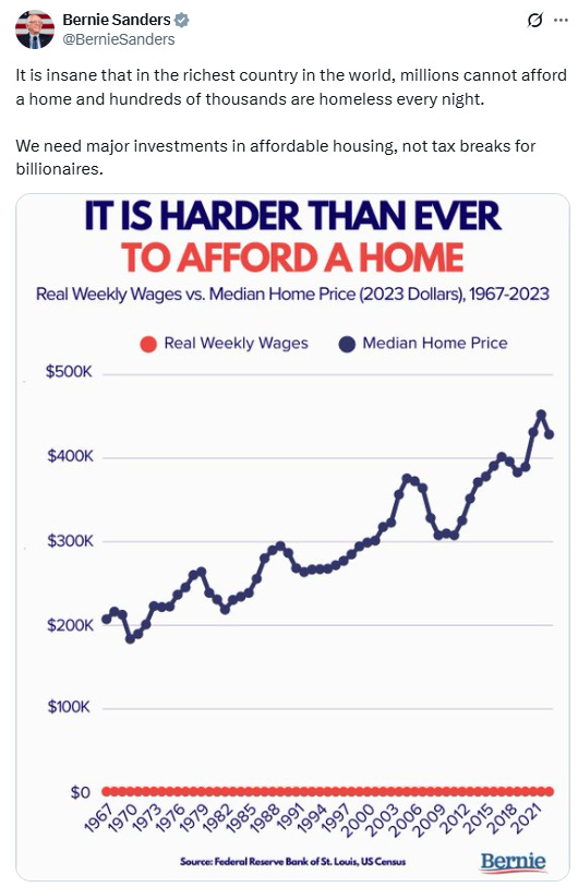
As I’ve discussed previously in my Terrible Chart series (trademark pending), the biggest giveaway to a bad chart is a curious choice of variables. In this case, the variables are median home price and real weekly wages. At least the chart has one thing right. Both wages and home price account for inflation. There is a little ambiguity. Median home price is given in 2023 dollars. Fair enough. Weekly wages, however, is just given as “real weekly wages”. Does that mean weekly wages are also being benchmarked to the 2023 dollar? Or to some other year? Regardless, at least the creator recognized that variables need to be corrected for inflation.
The choice of variables, however, makes no sense. No one would ever compare the price of a home to weekly wages because no one is buying a home with the money they made that week. It doesn’t make any sense to say, “Well I make $1,000 a week after taxes, so there’s no way I could afford a home that costs more than $3,000. Where would I come up with the money?” People don’t do that. Instead, homebuyers are advised to either compare the home price to their annual income or the monthly mortgage to their monthly income. The general rule is that you can afford a home that is up to three times a person’s gross annual income (before taxes), or a mortgage that is up to 30% of a person’s gross monthly income. This should be the comparison. Give us a chart that shows how home prices have changed as incomes have changed. Many others have already done this - the price-to-income ratio has gone up significantly over the past 50 years.
The terrible choice of variables is obvious from the chart itself. Anytime a line graph is stuck at “$0” the entire time, it doesn’t tell the reader anything. Even someone with no economics knowledge knows that real wages have increased since the 1960s. You know, that time when the typical family had one car and had never been on an airplane. As Sanders likes to constantly mention, a lot of the wage gains have gone to the wealthy. Fine. But make no mistake, the poor of 2025 are far better off than the poor of 1965.
Of course, real weekly wages aren’t stuck at $0. It just looks that way because the typical house costs hundreds of thousands of dollars, while the typical weekly wage is only in the thousands. The latter variable gets compressed down to the horizontal axis and is indistinguishable from zero. It’s like comparing bushels of corn harvested per year to number of corn farmers. There are over hundred thousand corn farmers in the US, but the US produces billions of bushels of corn per year. Any graph plotting the two together will make it appear as if there are zero corn farmers, yet billions of bushels of corn. This is a rare instance where a dual-axis chart, that is, a chart with two different scales overlaid on one another, would actually be an improvement. Put home price in hundreds of thousands of dollars on the left side, and real weekly wages in thousands of dollars on the right. This would still be inferior to just comparing real average mortgage to real monthly wages, but at least one would be able to see how the metrics have changed.
The bizarre thing is that misleading charts are usually created to produce a false picture of the world. With housing, no manipulation is needed! The reality is that housing is becoming less affordable each year. Housing prices have gone up relative to incomes. Middle-class families have been effectively priced out of the most livable areas of the country. I have no idea how any household with one working adult can afford anything more than a shack that is currently on fire, and even then, it would be a stretch. Sanders, of course, has no clue how to fix the problem (hint: BUILD MORE HOUSING), but his social media team doesn’t need to resort to a chart crime to make the point.