But which inflation?
How to gauge the different measures

I received a request from a loyal Econsoapbox reader (there are dozens of you!) to discuss the various measures of inflation and how to think about them. The reader asks
Did you ever [post] about the differences between the various inflation indexes and or should you expect your income growth to exceed inflation?
Specifically, looking for feedback on which indices to reference and how much people should be looking for in annual compensation increases if they don’t want to lose ground?
First, it’s important to know that there are several different measures of inflation. The original measure, and the one that gets the most attention from the media, is the Consumer Price Index (CPI). The CPI tracks the prices of 80,000 goods and services each month and aggregates them into one index. Then, the change of that index from one year to the next is given as annual inflation. Here is a graph of annual inflation according to the CPI:
The strength of the CPI is that it is based on an impressive amount of goods and services (80,000!). It gives a fairly accurate depiction of how much prices are evolving in the US economy. The downside is that food and energy make up a large portion of the CPI. This makes sense; consumers spend a lot on food and energy. For predictive power, however, this is not good. Food and energy prices are volatile. As any consumer will tell you, gas prices ricochet back and forth much more than the price of clothing or rent. Food prices are also unpredictable. The problem is that changes in the CPI because of food or energy price swings don’t tell you much about future prices; the government doesn’t want to alter policy based on facts that might only be true for a short time period.
Because of this, the government also keeps track of Core CPI, which is the CPI but without food and energy. Below is the graph of Core CPI:
Additionally, the Fed has it’s own preferred measure of inflation, called the Personal Consumption Expenditure (PCE). The PCE gathers data from businesses rather than consumer surveys, and attempts to make an index for all consumers, while the CPI is for urban consumers only. The graph of Core CPI is below:
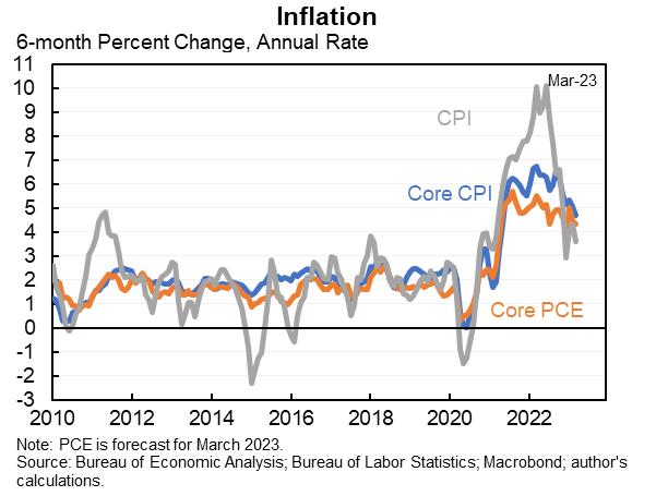
Jason Furman has made his own overlay of the three graphs as well:
Comparing the three graphs shows the increased volatility of the CPI. While Core CPI and Core PCE look fairly similar, CPI is different in several ways. First, it CPI peaks close to 9%, while Core CPI and Core PCE peak at around 6.5% and 5.5%, respectively.
So which should you care about?
If you want to have a general gauge of how prices have changed over the last year, the best is the CPI, especially if you do not live in a rural area. The sheer number of goods included gives a great snapshot of how prices are changing in America. As far as what to expect regarding the Fed and interest rate changes, the measure to track is Core PCE. The Fed is committed to a 2% inflation target, and will continue to raise interest rates until they think that 2% is likely to be achieved. Based on the CPI, one might think that time is near, as CPI has fallen from 8.9% to 5.0%. But the Fed uses Core PCE, which has only dropped from 5.4% to 4.6%, showing that there is still a ways to go. Because of this, I expect another interest rate increase in May.
The reader’s second question, about how they should use inflation indices when negotiating raises, is trickier. The thing about an index is that is just that, an average. The CPI attempts to determine how much the prices of the goods and services have gone up for the “typical consumer”. This is good for directing policy, but not necessarily useful for a individual consumer. After all, how could it be? Someone that lives in New York City, owns a condo, doesn’t have a car, and only spends two weeks a year out of the city is going to spend their money on a very different things that someone who lives in Kansas City, rents an apartment, leases a car, and loves to travel.
The most recent CPI report shows that discrepancy. Breaking down that 5% increase for all items shows a wide variety of price changes. Food has increased by 8.4%, new vehicles increased by 6.1%, used vehicles decreased by 11.2%, shelter increased by 8.2%, transportation services (i.e. plane tickets) increased by a whopping 13.9%. Energy on the other hand, decreased by 6.4%. So how much an individual’s costs increased or decreased will vary widely based on what they spend their money.
At the same time, it’s doubtful that many people understand this nuance. So when arguing for a raise, it may just be best to point at the CPI over the last year and say, “Boss, inflation this year was 5%! I need at least a 5% raise just to tread water.” It won’t be super accurate to any individual’s personal inflation, but it should be in the general ballpark. Of course, if an individual believes their personal inflation to be significantly higher, they can use that argument as well.


It would be fun if employers considered inflation when determining raises, wouldn't it!