Econ 101: Labor Market Statistics
How to evaluate competing claims about the labor market

This is the first installment of the Econ 101 series, which will explain various aspects of economics that I think will be interesting and informative. Please let me know if you agree!
There has been a lot of interest in the labor market lately. Many headlines have focused on the unemployment rate hitting 3.4%, one of the lowest unemployment rates ever recorded. The White House was quick to point out that 2021 and 2022 were “the two strongest years of job growth in history”. Axios ran an article titled “America's mind-blowing labor market”. So what’s all the fuss about? On February 3rd the Bureau of Labor Statistics (BLS) released its latest survey data that showed that a surprising 517,000 jobs were created in January. Given that the Fed is currently trying to slow down the economy, this was surprising.
Of course there are two sides to every story, and several media outlets downplayed the news in various ways. Some economists are skeptical that the true hiring numbers were that high. Politifact did a good job putting the numbers into context. To some, it feels like the economy hast still not completely recovered from the pandemic response.
How does one evaluate the US labor market? There are different sources saying different things. Is looking at the unemployment rate enough? What other statistics/indicators are there?
The answer, is of course, not simple. Quantifying the health of the labor market is like quantifying the health of an individual. Different factors have to be weighed and considered against each other. With personal health, there are useful indicators that give you a general understanding of someone’s health, but they only give you a partial view. BMI is a great example of this; it gives you a rough idea of what someone’s general health might be but leaves out a lot of other factors.
The unemployment rate is like BMI; it is certainly useful, but incomplete. Here is what the unemployment rate has looked like since January of 1990:
This graph shows a lot of useful information. The 1990s were a great time for the American economy, and this is clear from the steadily decreasing unemployment rate. The Great Recession of 2008-2009 is clear; unemployment grew to almost 10%. The Covid pandemic is even more stark, with an unprecedented increase in unemployment occurring in March 2020, followed by a relatively quick reversion to the trend that existed in the years before Covid.
At the same time, unemployment rate is just one number. It doesn’t give a full picture. For starters, data gatherers have to decide who counts as “unemployed”. In the official unemployment numbers, to be considered unemployed, a worker cannot have worked at all in the last week and must have looked for work in the last four weeks. This measurement is known as U-3, and it’s a fine definition, but it forces a large grey area to be black or white. If a worker has been unemployed for nine months and stopped looking for work five weeks ago, they are no longer counted as unemployed. Additionally, a construction worker who is only working 20 hours a week, counts as employed, even if they want to be working a full-time job.
To address these issues, the BLS computes several alternative measures of unemployment that count discouraged workers and underemployed workers as unemployed workers, known as U-6:
So why isn’t U-6 used more widely? For starters, it’s more difficult to measure discouraged workers and underemployed workers than unemployed workers. Also, the two graphs are almost identical; the only difference is the second graph is shifted up 5-10 percentage points. Any information gleaned from one can usually be gleaned from the other. The BLS also has only computed U-6 since 1994, so it can’t be used to compare today’s unemployment to those of the 1980s or older.
No matter what unemployment rate is used, it still provides an incomplete picture of the labor market because it only provides information on those working or those who want to work. A large number of Americans are in neither group. They are not in the labor force at all, and aren’t counted when tabulating the unemployment rate. This could be because they are in school, a stay-at-home parent, etc. The percentage of Americans who are working or are actively looking for work is known as the labor force participation rate (LFPR). Graph is below:
This graph also tells us a lot. You can see that from 1965-2000 the LFPR slowly grew. After 2000 it has fallen steadily to the point that the LFPR today is the lowest it’s been today since 1977 (not including the Covid recession). This could perhaps explain why the unemployment rate is so low today; sure, fewer people are unemployed, but also, fewer people want to be working.
Unfortunately even this is incomplete. While it’s easy to say, “fewer people want to work today and that’s the problem!”, comparing the 1990s to today is not apples-to-apples. The hint is in the steady increase during the last third of the 20th century and subsequent decrease. Most can probably guess the first cause - more women in the workplace. The second cause, however, is more subtle - the Baby Boomers leaving the workforce. The Baby Boomers are a massive generation; the biggest as a percentage of the US population ever recorded. The US benefited from this large generation throughout the 1990s and 2000s, as most Boomers were prime working age. Now, unfortunately, the US has to deal with the most consequential generation in US history leaving the labor market. As Boomers retire, that is going to put downward pressure on the LFPR, and means a lower LFPR today compared to 1995 is not just the result of fewer people wanting to work.
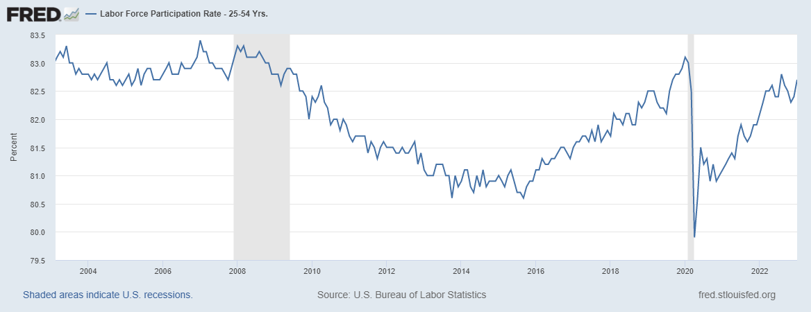
Fortunately there is yet another statistic to account for demographic trends: the prime-age LFPR. The prime-age LFPR looks at the LFPR for those between 25 and 55 years old; the years you expect the majority of individuals to be working. Looking at the prime-age LFPR over the last 20 years reveals some interesting trends:
Here you can see that the prime-age LFPR was steadily decreasing after the Great Recession until 2016 but then began to rebound (the prime-age LFPR peaked in the late ‘90s). Covid, however, has totally arrested that trend. I’m not sure why the prime-age LFPR decreased from 1998-2016 and then began to rebound. The total stoppage of this trend, though, starts to point to some of the continuing tightness in the labor market today; without Covid there would likely be more prime-age individuals in the labor force.
Yet another indicator counts the total number of employees working in America. Consider the graph:
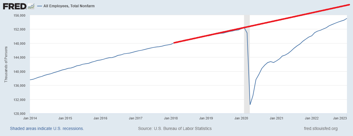
After the Great Recession, total employees was growing at a decent clip. Then Covid happened. Zooming in on the last 13 years and extrapolating what likely would have happened without Covid (the red line) shows that the US labor market has fewer workers than one would have predicted in 2019:
There are several million workers missing. Who are they? Because the prime-age LFPR is about level today as in 2019, but the total LFPR is lower, that allows economists to hone in on the likely source - older workers. And this appears to be what is happening. Just look at the LFPR for workers 55 or older:
Covid hit, and a significant percentage of older workers left the labor force entirely. Note that this is a percentage, so it would account for the disproportionate impact the Covid death toll had on older individuals. A lot of older workers left the workforce during Covid and stayed out. This is largely responsible for the continuing tightness in the labor market. The age of these former workers is important, because it likely means there aren’t any readily available substitutes. Unlike other demographic groups, individuals in their 50s (or older) aren’t likely to rejoin the labor market after a multi-year absence. So the American economy needs to adjust.
In sum, those looking to understand the labor market need to consider a variety of statistics. The traditional U-3 unemployment rate is a great start. It provides a useful benchmark that has been calculated since 1948. But to understand the full picture, it is important to look at other statistics as well.


Cool to see how each calculation is just another layer of the onion. People will just stop peeling once they reach the layer that matches their narrative.