
How not to think about wealth inequality in America
A seductive video and paper

There’s a popular video on wealth inequality in America that I stumble across every now and then. The video is linked above. It’s only six minutes long, so I recommend watching it in its entirety. The video purports to compare what Americans think the ideal distribution of wealth in America would be, what Americans believe the current wealth distribution is, and then the actual wealth distribution. The information is based on a study conducted by two American academics, one from Harvard and the other from Duke.
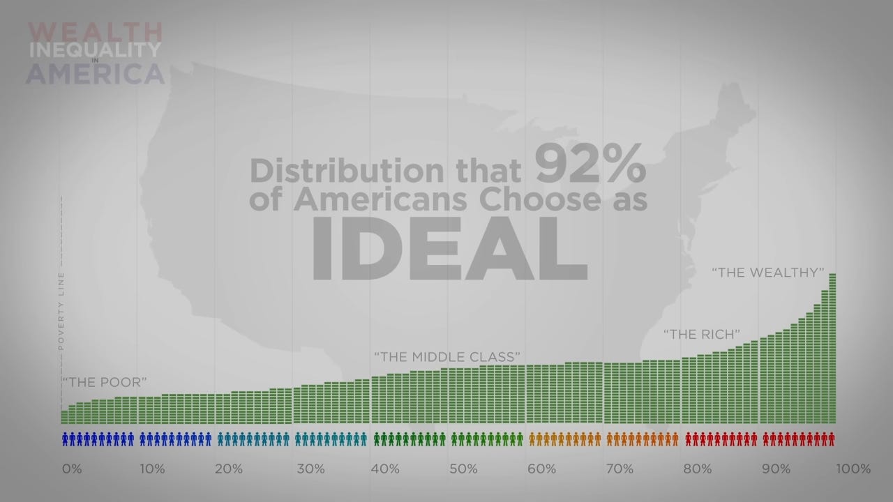
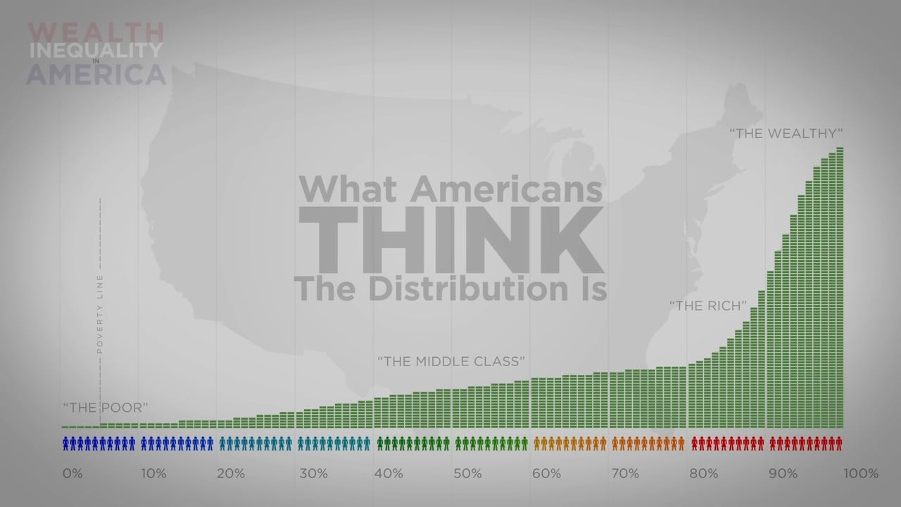
The video is incredibly well-made. The graphics, music, and packaging is fantastic. Transitioning from staid bar graphs to treating America as if it was 100 individuals and showing the stacks of money each person would have is brilliant. It’s easy to see how the video has racked up 25 million views. The message is also persuasive. The video does a good job comparing the ideal, to the perceived reality, to the actual distribution of wealth in the US. Take a look at the bar graph below. Again, the bottom bar is what, according to a survey of over 5,000 Americans, people believe is the ideal wealth distribution is, the middle bar is what Americans think the wealth distribution is, and the top bar is the actual distribution of wealth in the US. This data is from about 20 years ago, although it’s probably fairly similar to today.
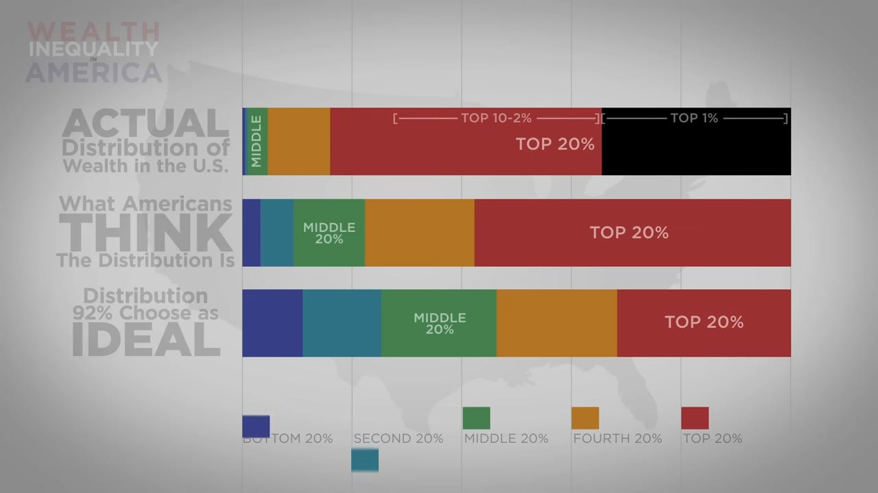
When the three bars are put into the “if America was 100 individuals” format, it paints a compelling image. Compare the three:
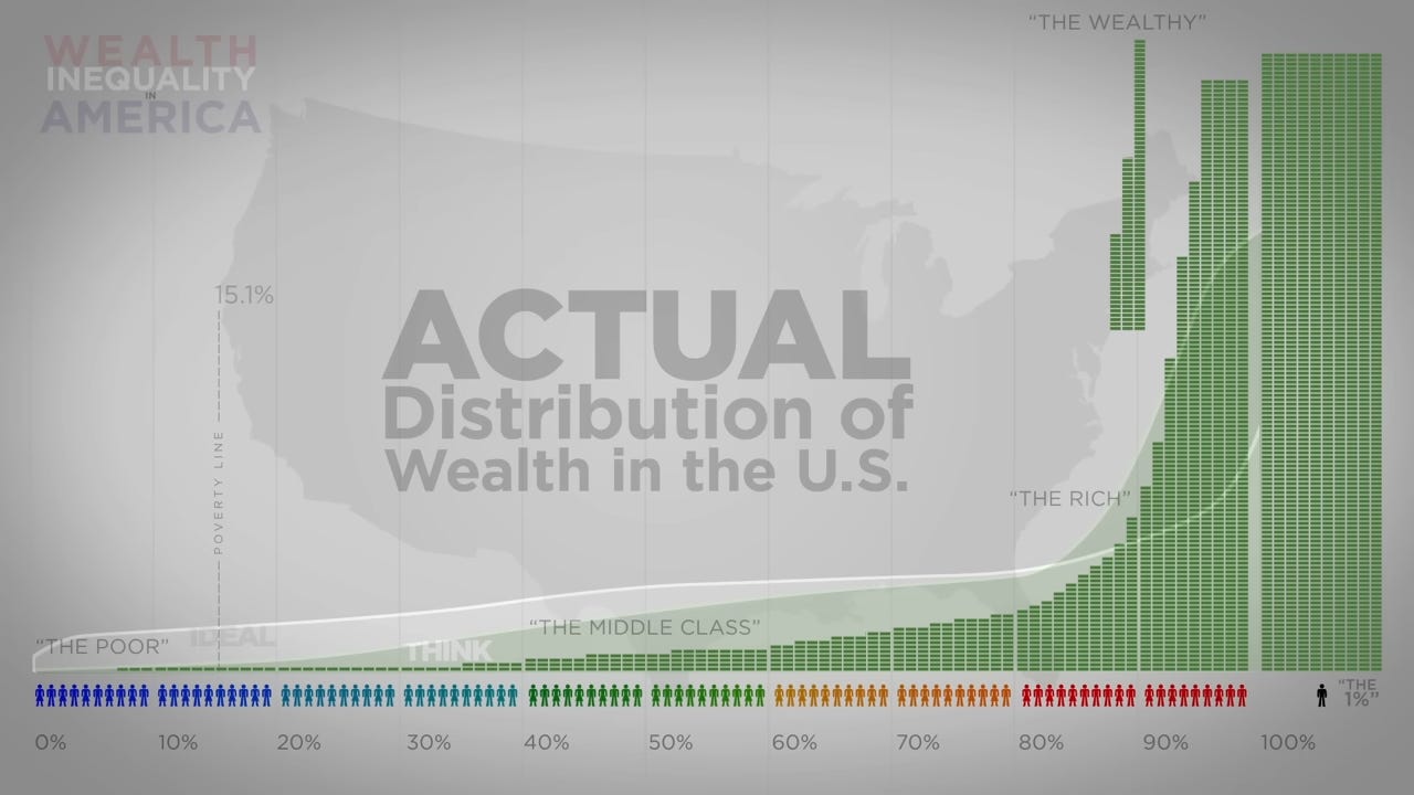
Whoa. As you can see, the results are extremely skewed. In the actual wealth distribution, the top 1 percent has more wealth than the bottom 80 percent. Those in the bottom 10 percent basically have nothing. Even those in the middle class pale in comparison to those in the top 10 percent. Then there is one person at the top, hoarding wealth like a dragon hoards gold. For those not familiar with wealth distributions, this is probably shocking. It looks like we live in a society where the richest five percent have everything, leaving the rest of America with table scraps.
The reality is far more nuanced. The video, and the underlying study the video is based on, lack context and sometimes are downright deceitful.
The biggest problem with the video is that it’s introducing a concept that the typical non-economist has no context for: wealth distribution. Anytime you survey people on a novel concept you’re going to get results that seem very out of sync with reality. Asking people about the wealth distribution is like asking people about the famous birthday problem. The latter is a simple question - how large would a group of people have to be in order for there to be a 50 percent chance that at least two of them share a birthday? Given there are 365 days in the year, people will often guess that a large number of people is needed to have a 50 percent chance that two share a birthday. Predictions will often top 100 people. The surprising reality is that it only takes 23 people for there to be a 50.7 percent chance that two share a birthday. By the time you’ve hit 50 people, there is already a 97.0 percent chance at least two share a birthday.
For those with no background in statistics or probability, this seems impossible. The reality is that probability is often very counterintuitive. It often goes against common sense. A concept like wealth distribution is the same. Ask random people on the street what their ideal wealth distribution is, and they will give a highly egalitarian society. This is understandable, but a little context would show the naivety of this mindset.
First and foremost, there is an incredibly powerful life-cycle aspect to wealth. Looking at the bottom five percent, the video often describes those individuals as “poor” with only “pocket change”. This is conflating wealth and income and is misleading. Throughout the video, the narrator uses the terms wealth and income interchangeably. They are not. Wealth means the total assets minus debt. It is the total sum of all you’ve accumulated over your lifetime. The latter means how much someone was paid, usually given in yearly increments. They are totally different concepts. To further the confusion, the video places the poverty line on the graph. This makes no sense. The poverty line is based on income, not wealth. It worries me that either the author of the video doesn’t understand the difference between wealth and income or is deliberately conflating the two.
There are hundreds of thousands of high-income individuals who not only have low wealth, they have negative wealth. Attending physicians at hospitals make big bucks, but at the beginning of their career have six-figure debt. Many other college graduates in their 20s are similarly situated. A 25-year-old making $100,000 a year is doing very well and will likely become wealthy. On that graph, however, if that 25-year-old has $25,000 in student debt, or worse yet, has just bought a house, he would appear on the far left of the wealth spectrum. We even have a word for these people - they are HENRYs, or High Earners, Not Rich Yet. I’m not going to spend time worrying about a young lawyer making $125,000 a year who doesn’t have any wealth. Neither should you.
Meanwhile, consider an upper-middle-class 65-year-old American. One who has worked a regular job their entire life, say in a non-supervisory corporate job. These individuals have never been high-income. They’ve been comfortably in the middle class for their professional careers. Yet they are today millionaires. Not the type of millionaire who has three houses and a boat. The type of millionaire who first became a homeowner in the 1980s or 1990s, now owns their current home outright, and has a 401K worth over a million dollars. There are millions of Americans like this. People who make up the top ten percent, not because they are high income, or ever were, but because they have slowly accumulated wealth through the decades. If you were to include pensions for the millions of public sector workers as wealth, this group would be even larger. The point being that low-wealth individuals are not all poor, and high-wealth individuals are not all rich.
The reality is that the “ideal distribution” that Americans claim they want is not grounded in reality. It ignores life cycles entirely. It also ignores that no developed country has ever had a wealth distribution that equal. There are no rich people in the ideal distribution, just some who are moderately better off. Even the best heart surgeon only has a wealth about ten times that of an unemployed 20-year-old. This, contrary to the video, is not a system that has good incentives to succeed. The typical person would not devote themselves to a life of hard work and dedication if they knew that the absolute best-case scenario would be a doubling of wealth compared to the average person.
The perceived distribution of American wealth also shows a lack of understanding of reality. In any society the top one percent is always significantly better off than the rest of the country. In a capitalist society, the gap is massive. The top one percent are going to be Fortune 500 CEOs, top athletes, famous movie stars, and top performers in their field. They make a lot of money in any wealthy country. Even outside of capitalism, there is always a super-wealthy class of individuals. In communism, these are going to be top government workers. Which strikes me as a far worse system than the dog-eat-dog world of capitalism.
One of the biggest giveaways that the actual wealth distribution makes things seem worse than they are is how the typical American experience is framed in the video. I think there’s a solid argument that the bottom 10 percent of Americans are significantly poorer than we would expect given the massive wealth of the country. To claim that only the top 10 percent are wealthy, however, is absurd. The median American, let alone an American in the 70th percentile, is doing fantastic! The average American household occupies a single-family home, has two cars, and goes on at least one vacation a year. They have more than enough money for all of their needs and many of their wants to be met. The US is one of the wealthiest societies the world has ever seen, and to act as if only the top 10 percent are well-off is absurd.
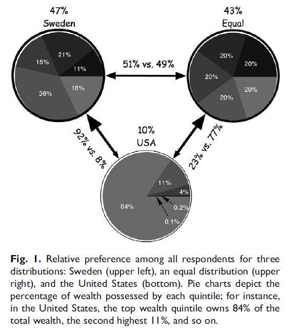
Looking at the ideal wealth distribution also sparked a question. How could it be, as the video claims, that 92 percent of Americans from across the political spectrum agree this is the ideal? 92 percent of Americans don’t agree on anything. How could they possibly all agree on the same ideal wealth distribution? I looked up the underlying study the video is based on, titled “Building a Better America—One Wealth Quintile at a Time” by Michael I. Norton and Dan Ariely (yes, that Dan Ariely). It turns out the video is wrong. 92 percent of Americans didn’t agree on an ideal wealth distribution, they agreed one hypothetical wealth distribution was better than another. Take a look at this chart from the Norton and Ariely paper:
I originally only looked this up to confirm my belief that the video was wrong. Once I dug more into the numbers, I discovered that not only is the YouTube video misleading, but the underlying study misrepresents its findings.
It’s worth mentioning that the underlying study is an important one. It’s in a highly-ranked and well-regarded interdisciplinary journal. Moreover, it’s been cited over 1,500 times. Its conclusions are also nonsense. The authors showed over 5,000 Americans the three pie charts and asked them which one they preferred. In the study, the three pie charts were unlabeled. In reality, one corresponded to Sweden, one to the United States, and the final one depicts perfect equality. Here is the headline-grabbing claim from the paper:
As can be seen in Figure 1, the (unlabeled) United States distribution was far less desirable than both the (unlabeled) Sweden distribution and the equal distribution, with some 92% of Americans preferring the Sweden distribution to the United States. In addition, this overwhelming preference for the Sweden distribution over the United States distribution was robust across gender (females: 92.7%, males: 90.6%), preferred candidate in the 2004 election (Bush voters: 90.2%; Kerry voters: 93.5%) and income (less than $50,000: 92.1%; $50,001–$100,000: 91.7%; more than $100,000: 89.1%). In addition, there was a slight preference for the distribution that resembled Sweden relative to the equal distribution, suggesting that Americans prefer some inequality to perfect equality, but not to the degree currently present in the United States.
This tripped my bullshit detector for two reasons. First, there is no way the Sweden and USA wealth distributions are that far apart. Sweden is more equal than the United States, but it’s still a market economy. According to the pie charts, Sweden’s top 20 percent has a smaller portion of the nation’s wealth than America’s top one percent. No way, especially when Sweden has one of the highest billionaires per capita of any country. Sure enough, the details are in the text of the paper:
Unbeknownst to respondents, a second distribution reflected the wealth distribution in the United States; in order to create a distribution with a level of inequality that clearly fell in between these two charts, we constructed a third pie chart from the income distribution of Sweden (Fig. 1).
This is not just biased framing. Norton and Ariely are misrepresenting their findings. To compare the income distribution of Sweden to the wealth distribution in the US, and have the caption on the relevant figure imply that both pie charts are wealth distributions, is deceitful. Why would you compare the wealth distribution of the United States to the income distribution of Sweden? The answer is buried in a footnote:
We used Sweden’s income rather than wealth distribution because it provided a clearer contrast to the other two wealth distribution examples; although more equal than the United States’ wealth distribution, Sweden’s wealth distribution is still extremely top heavy.
A ha! So it turns out even Sweden has such a skewed wealth distribution that the authors turned to a different metric and then acted as if they were comparing apples to apples. This is deeply disingenuous.
The second reason the finding tripped my bullshit detector was that basically half of Americans said they preferred complete equality, that is, the top right pie chart, to their “unequal but still fair” distribution of the top left pie chart. No way. The claim that half of Americans would prefer total wealth equality, a state of existence no communist country has ever reached, over a wealth distribution more equal than even a Scandinavian nation is nonsense. Americans believe strongly in individualism and meritocracy. It means either respondents didn’t understand what they were being asked or the question was asked poorly. Sure enough, reading the paper shows it is the second. Respondents were asked which of the three pie charts the would prefer to live in, along with this context:
‘‘In considering this question, imagine that if you joined this nation, you would be randomly assigned to a place in the distribution, so you could end up anywhere in this distribution, from the very richest to the very poorest.’’
It might seem subtle, but the phrasing is crucial. Respondents weren’t asked what society they would prefer to live in, which would presumably entail maintaining their relative wealth, but which society they would prefer to live in given random assignment. Those are two completely different things! Asking people which society they would prefer being randomly placed in is not the same as asking them which society they would rather live in. Most people are risk-averse, so of course if you tell them they have an equal chance to be in the bottom 10 percent as the top 10 percent they are going to choose the equal distribution. I would certainly rather have a guaranteed amount of middling wealth over risking losing everything. This isn’t quite as bad as conflating income and wealth, but is still bad framing.
I want to reiterate that this paper has been cited over 1,500 times, and the YouTube video has been watched over 25 million times. The former is an influential paper and the latter a popular video. They are both deeply misleading. The debate about inequality in America will continue for some time, perhaps forever. There are valid arguments on both sides of the debate. Shame on those who obfuscate and deceive in order to persuade.
Sweden has fewer than 12 million people. This's like comparing the US – the third largest 'country,' by population (350mil) – with a city. Rankles me. As does any comparison with teeny tiny states, like Norway (5mil), Denmark (6mil). Even comparisons to virtually homogenous Germany, France, and UK are dubious. (Blow you Euro friends' minds: 50 million latinos, 45 million blacks, in a 'country' spread across 4 time zones). Compare apples to apples, not cats to pogo sticks. (You too!)
Since you believe the approach of the video in considering wealth inequality in America is wrong, how do you yourself think about the subject?